Tonal Dressing or High Contrast? Two Ways to Build an Outfit
Tonal dressing or high contrast can shape an outfit’s visual rhythm; learn how to diagnose muddy, abrupt or unbalanced combinations and adjust them.
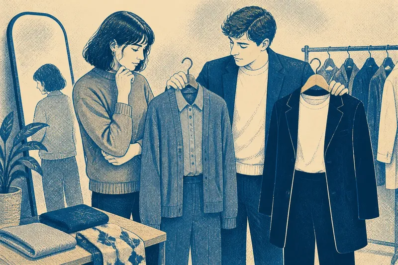
Tonal dressing or high contrast can change the feel of an outfit before anyone notices the individual pieces. A navy coat over a pale blue shirt makes the eye travel gradually; a black jacket over a white top gives it a sharper stop. Neither approach is more correct. Trouble usually starts when the palette’s rhythm does not match the clothes, the occasion or the effect you meant to create.
Think of tone as the relationship between colours, not a demand to dress in one shade. Tonal outfits use colours close in lightness, hue or both; high-contrast outfits set visibly different colours or light and dark values against each other. You can combine the two, too: a mostly tonal outfit with one crisp contrast often looks more deliberate than an outfit trying to make every piece equally noticeable.
Tonal Looks Too Flat
What is happening: The colours sit close together, but the outfit has no change in surface, shape or depth to give the eye somewhere to pause. A beige knit, beige trousers and beige coat can read as one uninterrupted area, particularly if the fabrics have similar textures and the silhouettes are similarly loose.
Why it happens: Matching colour is doing all the work. Tonal dressing is not simply wearing several versions of one colour; the outfit still needs distinctions. A ribbed jumper, smooth wool trousers and a brushed coat offer different surfaces, while a darker shoe or a lighter collar can create a quiet point of separation.
What to try, in order:
- Look at the outfit in daylight, rather than relying on how it appears under warm indoor lighting. Notice whether the garments actually differ in lightness.
- Change one texture first: pair fine knitwear with denim, a matte cotton shirt with satin, or smooth leather shoes with a nubby wool layer.
- If the pieces still merge, shift one item towards a deeper or paler shade within the same colour family.
- Use a small contrasting detail, such as a dark belt or a cream collar, only if the outfit needs a clearer visual break.
Say you have a slate-blue shirt, trousers and cardigan that look like a single block. Swap the cardigan for a textured charcoal jacket and keep the shirt and trousers; the expected result is a visible change in surface and depth without abandoning the tonal palette. Adding several accessories at once would make it harder to tell which adjustment helped.
Contrast Feels Abrupt
What is happening: A light and dark piece meet so sharply that the outfit looks divided into separate halves. A white top with black trousers is a clear example, though equally vivid colours can produce the same effect.
Why it happens: The contrast is doing its job, but there is no transition between the strongest blocks. The eye moves quickly from one to the other and may stop there, especially when the boundary lands at the waist or another prominent seam.
What to try, in order:
- Check where the two colours meet. A tucked top, open jacket or longer layer can alter that boundary without changing the palette.
- Introduce a middle value in a practical piece: a grey cardigan between white and black, for instance, or a mid-blue shirt between dark denim and a pale jacket.
- Repeat one of the main colours in a smaller area, such as shoes or a bag, if the outfit needs a visual link.
- Keep the contrast if you like its crispness. The aim is not to soften every strong pairing, but to decide whether the sharp division is intentional.
A bright scarf beside a dark coat can also provide a focused contrast rather than splitting the whole outfit. A scarf in a colour already present in the coat’s lining or a shirt can make that accent feel connected, although a matching accessory is not compulsory. Sometimes the abruptness is the point; clothes are not obliged to soothe the eye.
Colour Draws the Wrong Attention
What is happening: The outfit’s strongest contrast lands somewhere you would rather not emphasise, or a bright area attracts the eye before the garment’s shape and details have a chance to register.
Why it happens: High contrast is a visual signal. Where two colours meet, the edge becomes prominent; a contrasting belt, trouser stripe or colour-blocked panel can direct attention towards that spot. This is not a flaw in the body or the clothing, just a predictable effect of placement.
What to try: Move the strongest contrast to the face, hands or footwear if that suits the outfit’s purpose. If you want less emphasis at a particular junction, choose neighbouring tones there and reserve contrast for a detail elsewhere. Look at the full silhouette in a mirror, then at the individual colour blocks; the two views can suggest different adjustments.
Colour is only one part of the picture. A sharply tailored jacket can hold attention through its outline even in a tonal palette, while a loose, fluid outfit may make a vivid contrast feel less severe. Do not keep changing colours to solve a problem caused by fit, proportion or a garment that simply does not sit as you want.
Prints Disrupt the Palette
What is happening: A printed piece seems to clash with otherwise calm separates, or the outfit acquires several competing points of attention. The print may contain the right colours but still feel louder than the rest.
Why it happens: A pattern adds edges and repeated shapes as well as colour. A small geometric print can create a busy rhythm even in a restrained palette; a large, sparse floral may feel quieter despite using stronger colours. Matching every print colour to another garment often adds more signals than the outfit needs.
What to try: Pick one colour from the print for a neighbouring garment, then let the other pieces act as a visual pause. For a high-contrast print, keep the surrounding outfit simpler; for a low-contrast print, texture or a small bright accessory can supply definition. Consider the scale and spacing of the pattern as well as its colours.
It is not worth trying to make every shade in a print reappear elsewhere. A single considered link is usually enough, and an exact match can look more dutiful than expressive. If the print’s colours are difficult to separate from the garment beside it, change the neighbouring piece’s lightness or texture before adding another colour.
What Should You Adjust First?
How do I choose between tonal and high contrast?
Start with the mood and setting you have in mind, then consider the pieces already in your outfit. Tonal combinations tend to make gradual transitions; strong contrast makes boundaries more visible. Either can feel relaxed, formal, restrained or bold depending on fabric, cut and styling.
Can I mix tonal dressing with one bright colour?
Yes. Keep most pieces close in tone and use the bright shade as a single accent, such as a bag, shirt or pair of shoes. If the accent feels detached, repeat it in a small detail or choose a shade that relates to the outfit’s existing colours.
How can I tell whether an outfit has enough contrast?
Check whether the garments remain distinct when seen from a little farther away or in a photograph. If they merge, change the value, texture or outline of one piece; if a single junction dominates, soften that boundary or move the strongest contrast. The useful answer depends on the effect you want, not on a universal threshold.
Do shoes have to match the outfit’s palette?
No. Shoes can echo a colour already present, provide a quiet neutral base or create a deliberate contrast. Consider their visual weight alongside the rest of the outfit: a substantial dark shoe will read differently from a slim shoe in a similar colour.
Build a Clear Rhythm
When an outfit feels uncertain, identify the specific problem before replacing pieces. Ask whether the colours blend too much, divide too sharply, draw attention to an unintended spot or compete with a print. Then change one variable—lightness, texture, placement or colour—and check the whole silhouette again. This makes tonal dressing or high contrast a choice you can shape, rather than a rule to obey.
Keep the pieces that already work. A tonal base can take a contrasting layer for a sharper finish, and a high-contrast pairing can be softened by a textured middle layer without losing its character. The final useful check is to wear the outfit in the light you will actually meet; a palette that feels balanced by a window may behave quite differently under office fluorescents, which have never been known for their tact.